Chapter 2: The Structure of Art
Learning Outcomes
- Distinguish between various materials, processes, and methods in the production of art objects.
- Identify the characteristics of different art forms and distinguish one from another.
- Explain the roles of elements and principles of design in creating forms and compositions.
Three Main Categories
Two-Dimensional Art
Drawing
- Drawing media can be divided into two groups: dry media and wet media
- Pigment: coloring material
- Binder: substance that holds the pigment
Everybody draws. We routinely give children drawing materials so that they can entertain and express themselves, and they take to it so naturally that there can scarcely be a person above the age of two who has never made a drawing. A pebble scraped across a flat stone will draw a line. A stick dragged through the snow. The shaft of a feather in smooth, wet sand. Our finger on a fogged-up windowpane. Even if we have left the habit of drawing behind with our childhood, we retain a familiar connection to it. Perhaps it is this connection that makes drawings by even the most accomplished artists feel somehow not so far removed from our own experience. Drawing is both a noun and verb, it describes an object as well as an art process. It is a combination of observation and mark making on a flat surface. The drawing media can be divided into two broad groups: dry media and liquid media. Dry media are generally applied directly in stick form. As the stick is dragged over a suitably abrasive surface, it leaves particles of itself behind. Liquid media are generally applied with a tool such as a pen or a brush. Although some media are naturally occurring, most of today’s media are manufactured, usually by combining powdered pigment (coloring material) with a binder, a substance that allows it to be shaped into sticks (for dry media) or to be suspended in fluid (for liquid media), and to adhere to the drawing surface.
Charcoal
- Charcoal is made from wood that has been burned, in the absence of oxygen, leaving a pure black carbon powder.
- Charcoal must be protected with a fixative to prevent smearing or smudging.
The best-quality artist’s charcoal is made from special vine or willow twigs, slowly heated in an airtight chamber until only sticks of carbon remain—black, brittle, and featherlight. Natural charcoal creates a soft, scattered line that smudges easily and can be erased with a few flicks of a cloth. For denser, more durable, or more detailed work, sticks of compressed charcoal are available, as are charcoal pencils made along the same lines as graphite pencils.
Conté Crayon
- Compressed pigment compounded with clay and greasy binder.
Perhaps the most well-known artist’s crayon is the conté crayon. Developed in France at the turn of the 19th century, it consists of compressed pigment compounded with clay and a small amount of greasy binder. Comes in a variety of colors, originally white, black, and sanguine (deep red), and differing ranges of hardness. Today conte crayons come in a full range of colors. The harder conte was used for details and the softer for broad areas.
Metalpoint
- Metalpoint is the use of malleable metal to make drawing marks on prepared surfaces.
Metalpoint, the ancestor of the graphite pencil, is an old technique that was especially popular during the Renaissance. Few artists use it now, because it is not very forgiving of mistakes or indecision. Once put down, the lines cannot easily be changed or erased. The drawing medium is a thin wire made of a relatively soft metal such as silver or gold, set in a holder for convenience. The drawing surface must be prepared by covering it with a ground, a preliminary coating of paint. Traditional metalpoint ground recipes call for a mixture of bone ash, glue, and white pigment in water. As the point of the wire is drawn across the dried ground, it leaves behind a thin trail of metal particles that soon tarnish to a pale gray.
Graphite
- Graphite is a crystalline form of carbon.
A soft, crystalline form of carbon first discovered in the 16th century, graphite is a naturally occurring drawing medium. Pure, solid graphite need only be mined, then shaped into a convenient form. Dragged across an abrasive surface, it leaves a trail of dark gray particles that have a slight sheen. Graphite was adopted as a drawing medium soon after its discovery. But pure, solid graphite is rare and precious. (In fact, there is only one known deposit.) Found in the 16th century in England. More commonly, graphite must be extracted from various ores and purified, resulting in a powder. Toward the end of the 18th century, a technique was discovered for binding powdered graphite with fine clay to make a cylindrical drawing stick. Encased in wood, it became what we know as a pencil, today the most common drawing medium of all.
Pastels
- Pastels are composed of finely powered colored pigment and binder.
Pastel consists of pigment bound with a nongreasy binder such as a solution of gum arabic or gum tragacanth (natural gums made from hardened sap) and water. The principle is simple enough that artists can manufacture their own if they choose, mixing pigment and binder into a doughy paste, then rolling the paste into sticks and letting it dry. Available in a full range of colors and several degrees of hardness, pastel is often considered a borderline medium, somewhere between painting and drawing. Artists favor soft pastels for most work, reserving the harder ones for special effects or details. Because they are bound so lightly, pastels leave a velvety line of almost pure pigment. They can be easily blended by blurring one color into another, obliterating individual strokes and creating smoothly graduated tones. Pigments like charcoal must be protected with a fixative to prevent smearing.
Oil Pastels
- Oil pastels are artist-quality wax crayons that have a creamy consistency.
Oil pastels are artist-quality wax crayons that have a creamy consistency that facilitates blending. They are a convenient way to apply and blend heavily textured pigments without use of brushes. Colors are vibrant and marks are gestural and immediate. They show the ”hand of the artist”.
Ink
- Ink is the combination of colored pigment and a binder suspended in a liquid.
Drawing inks generally consist of ultrafine particles of pigment suspended in water. A binder such as gum arabic is added to hold the particles in suspension and help them adhere to the drawing surface. Inks today are available in a range of colors. Historically, however, black and brown inks have dominated, and been manufactured from a great variety of ingenious recipes since at least the 4th century B.C.E. There are endless ways to get ink onto paper. You could soak a bit of sponge with it and swipe a drawing onto the page. You could use your fingertips, or a twig. But if you want a controlled, sustained, flexible line, you’ll reach for a brush or a pen. Traditional artist’s pens are made to be dipped in ink, then set to paper. Depending on the qualities of the nib—the part of a pen that conveys ink to the drawing surface—the line a pen makes may be thick or thin, even in width or variable, stubby and coarse or smooth and flowing. Today most pen nibs are made of metal, but this is a comparatively recent innovation, dating only from the second half of the 19th century. Before then, artists generally used either reed pens—pens cut from the hollow stems of certain plants—or quill pens—pens cut from the hollow shafts of the wing feathers of large birds. Both reed and quill pens respond sensitively to shifts in pressure, lending themselves naturally to the sort of varied, gestural lines we see in Rembrandt van Rijn’s Cottage among Trees. Rembrandt applied more pressure to draw the thick lines of the fence and less for the thin, wispy lines describing the far distance.
Painting
- Paint is composed of three main ingredients:
- Pigments
- Binders
- Solvents
- There are different types of paint:
Painting is a specialized form of drawing that uses brushes to apply colored liquids to a support, usually canvas or paper. Sometimes wooden panels, metal plates or walls. Paint is composed of three main ingredients: pigments, binders and solvents. The pigment or coloring agents in each type of paint is the same. The binder differs from one type of paint to the next.
Oil Paint
- Oil paint uses oils as the binding agent.
- Most common oils today are linsed oil, poppy seed oil, or safflower oil.
-
Fugitive: oil paints that lose their color over time, especiallt when exposed to direct sunlight
- EX: Leonardo da Vinci, Detail of the eyes Mona Lisa, c.1503-1519, oil on poplar.
Oil paints consist of pigment compounded with oil. Historically, the most commonly used oils have been linseed oil, poppy seed oil, and walnut oil. Today, commercial manufacturers of artist’s colors often grind darker pigments with linseed oil and light pigments such as white and yellow with poppy seed oil or safflower oil, which do not yellow over time, as linseed oil tends to do. What all these oils have in common is that they will dry at room temperature, leaving the pigment particles suspended in a transparent film. Turpentine is generally used as a solvent in oil painting. Oil paint dries very slowly, allowing artists far more time to manipulate the paint. Colors can be laid down next to each other and blended softly and seamlessly. They can be painted wet-on-wet, with a new color painted into a color that is not yet dry. They can be scraped away partially or altogether for revisions or effects. Oil paint can be applied in a range of consistencies, from very thick to very thin. Oil paintings can also be made with glazes—thin veils of translucent color like stained glass applied over a layer of opaque paint. This creates a luminous, glowing effect. Some pigments, especially from early oil paintings, have been found to be fugitive, meaning they lose their color over time, especially when exposed to direct sunlight.
Acrylic Paint
- Acrylic paint uses water-soluble acrylic polymer as the binding agent.
Acrylic paint uses water-soluble acrylic polymers as the binding agents. Water is the solvent. Acrylic dries very quickly and can be used to build up thick layers very quickly. Acrylics dry quickly and permanently. Artists usually rest their brushes in water while working to keep it from drying on the brushes. One problem with acrylic is that the colors can subtly change as it dries. It is less suitable for portraits because of this subtle change.
Watercolor
- Watercolor paint suspends colored pigments in water-soluble gum arabic as the binder.
Watercolor consists of pigment in a vehicle of water and gum arabic, a sticky plant substance that acts as the binder. As with drawing, the most common support for watercolor is paper. Watercolor is commonly thought of as an intimate art, small in scale and free in execution. Easy to carry and requiring only a glass of water for use, they could readily be taken on sketching expeditions outdoors and were a favorite medium for amateur artists. The leading characteristic of watercolors is their transparency. The white of the paper serves for white, and dark areas are built up through several layers of transparent washes, which take on depth without ever becoming completely opaque.
Encaustic Paint
- Encaustic paint uses wax as the binder and must be applied to rigid supports like wood with heated brushes.
Encaustic paints consist of pigment mixed with wax and resin. When the colors are heated, the wax melts and the paint can be brushed easily. When the wax cools, the paint hardens. After the painting is completed, there may be a final “burning in” as a heat source is passed close to the surface of the painting to fuse the colors. Literary sources tell us that encaustic was an important technique in ancient Greece. The earliest encaustic paintings to have survived, however, are funeral portraits created during the first centuries of our era in Egypt, which was then under Roman rule. Portraits such as this were set into the casings of mummified bodies to identify and memorialize the dead. The saturated colors of this painting, almost as fresh as the day they were set down, testify to the permanence of encaustic.
Tempera
- Egg tempera uses dry colored pigments mixed with egg yolk.
Tempera painting is a type of painting that has been around for centuries. Tempera is an aqueous medium like watercolor that dries to a tough, insoluble film. Its colors retain their brilliance and clarity for centuries. Technically, tempera is paint in which the vehicle is an emulsion, which is a stable mixture of an aqueous liquid with an oil, fat, wax, or resin. The most famous tempera vehicle is a naturally occurring emulsion, egg yolk, called egg tempera. Tempera dries very quickly, and so colors cannot be blended easily once they are set down. Not a very forgiving medium. Although tempera can be diluted with water and applied in a broad wash, painters who use it most commonly build up forms gradually with fine hatching and cross-hatching strokes, much like a drawing. Traditionally, tempera was used on a wood panel support prepared with a ground of gesso, a mixture of white pigment and glue that sealed the wood and could be sanded and rubbed to a smooth, ivorylike finish.
Fresco
- The process of painting on plaster.
- Buon fresco, or “true” fresco, is painting on wet plaster/
- Fresco secco, or drt fresco, is done after the plaster has dried.
Fresco, pigments are mixed with water and applied to a plaster support, usually a wall or ceiling coated in plaster. The plaster may be dry, in which case the technique is known as fresco secco, Italian for “dry fresco.” But most often when speaking about fresco, we mean buon fresco, “true fresco,” in which paint made simply of pigment and water is applied to wet lime plaster. As the plaster dries, the lime undergoes a chemical transformation and acts as a binder, fusing the pigment with the plaster surface. Fresco is above all a wall-painting technique, and it has been used for large-scale murals since ancient times. Probably no other painting medium requires such careful planning and such hard physical labor. The plaster can be painted only when it has the proper degree of dampness; therefore, the artist must plan each day’s work (giornate – jornate) and spread plaster only in the area that can be painted in one session.
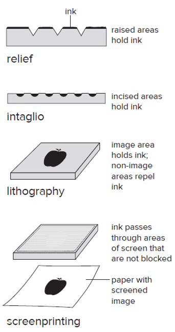
Printmaking
- Printmaking uses a matrix to transfer an image called an impression to another surface.
- There are four main types of printmaking: relief, intaglio, planographic and stencils.
Printmaking uses a matrix to transfer an image called an impression to another surface. A matrix is the surface on which a design is prepared before being transferred through pressure to a receiving surface such as paper. The image left is called an impression. Printmaking allows multiple copies of an artwork to be made, that is why it is called the art of multiples. Multiple copies of an artwork are called an edition. There are four main types of printmaking: relief, intaglio, planographic and stencil.
Relief
- Relief prints are made by removing material from the matrix (the surface the image has been carved into) such as wood, linoleum or metal.
The term relief describes any printing method in which the image to be printed is raised from a background. Relief prints are made by removing material from the matrix (the surface the image has been carved into) such as wood, linoleum or metal. Think of a rubber stamp. When you look at the stamp itself, you may see the words “First Class” or “Special Delivery” standing out from the background in reverse. You press the stamp to an ink pad, then to paper, and the words print right side out—a mirror image of the stamp. All relief processes work according to this general principle.
Intaglio
- Intaglio prints are made when a design is scratched into a matrix, usually a metal plate.
Intaglio prints are made when a design is scratched into a matrix , usually a metal plate. Intaglio is exactly the reverse of relief, in that the areas meant to print are below the surface of the printing plate. The artist uses a sharp tool or acid to make depressions—lines, grooves, or pits—in a metal plate. When the plate is inked, the ink sinks into the depressions. Then the surface of the plate is wiped clean. When dampened paper is brought into contact with the plate under pressure, the paper is pushed into the depressions to pick up the image.
Planographic
- Planographic prints are made by chemically altering a matrix to selectively accept or reject water.
Planographic prints are made on a flat printing surface – it is not raised or depressed like the previous two methods. It depends on the principle that oil and water do not mix. Planographic prints are made by chemically altering a matrix to selectively accept or reject water. The artist first draws the image on the stone with a greasy material—usually a grease-based lithographic crayon or a greasy ink known by its German name, tusche. The stone is then subjected to a series of procedures, including treatment with an acid solution, that fix the drawing (bind it to the stone so that it will not smudge) and prepare it to be printed. To print the image, the printer dampens the stone with water, which soaks into the areas not coated with grease. When the stone is inked, the greasy ink sticks to the greasy drawing and is repelled by the water-soaked background areas. Although limestone is still the preferred surface for art prints, lithographs can also be made using zinc or aluminum plates.
Lithographic Printing
- Most commercial printing today is lithographic printing.
Lithography is a planographic process. Uses aluminum plates and offset printing. The inked image is transferred from a metal plate to a rubber cylinder and then to paper.
Stencil
- Stencil prints are most typically seen in screenprinting.
Stencil prints are made by passing ink through a porous fine mesh matrix. Silkscreen printmaking uses silk fabric on a rigid frame. The screen is a fine mesh of silk or synthetic fiber mounted in a frame, rather like a window screen. Working from drawings, the printmaker stops out (blocks) screen areas that are not meant to print by plugging the holes, usually with some kind of glue, so that no ink can pass through. Then the screen is placed over paper, and the ink is forced through the mesh with a tool called a squeegee. Only the areas not stopped out allow the ink to pass through and print on paper. To make a color screenprint, the artist prepares one screen for each color. On the “blue” screen, for example, all areas not meant to print in blue are stopped out, and so on for each of the other colors.
Original vs. Reproduction
- Original prints are overseen by the artist.
- Reproduction prints are mechanically produced.
Today, two broadly agreed-upon principles distinguish original artists’ prints from commercial reproductions. The first is that the artist performs or oversees the printing process and examines each impression for quality. The artist signs each impression he or she approves; rejected impressions must be destroyed. The second is that there may be a declared limit to the number of impressions that will be made. This number, called an edition, is also written by the artist on each approved impression, along with the number of the impression within that edition. For example, a print numbered 10/100 is the tenth impression of a limited edition of one hundred. Once the entire edition has been printed, approved, signed, and numbered, the printing surface is canceled (by scratching cross marks on it) or destroyed so that no further prints can be made from it. Reproduction prints are mechanically produced usually for commercial purposes. An original is photographed and transferred to a printing plate on a commercial press. Each print is identical.
Review Printmaking
Three-Dimensional Art
- Three-dimensional art goes beyond the flat surface to encompass height, width, and depth.
- Four methods
Low Relief Sculpture
- Low relief sculpture has limited project from the background surface.
A relief is meant to be viewed frontally, the way we view a painting. Artists in many cultures have decorated the surfaces of important objects and architecture with relief sculpture. A coin is a good example of low relief sculpture.The carving illustrated here is a deity with the body of a man, wings, and the head of an eagle. It once hung on the walls of a palace in present-day Iraq that was covered in relief carvings picturing the ruler and different gods. The deity pictured here is using a pinecone to sprinkle water from the bucket he holds. His body is robust, with individual muscles and even tendons visible. His clothing, sandals, hair, and wings have meticulously described texture and detail. The plants to either side are stylized in a repeating pattern of identical leaves. The markings that run across the middle of the sculpture are cuneiform text, a writing system developed in the ancient Middle East.
High Relief Sculpture
- High relief sculpture is where more than half of the sculpted form projects from the background surface.
This creates an effect called an undercut, where some of the projected surface is separate from the background surface.
Sculpture in the Round
- A freestanding work that can be viewed from any angle, for it is finished on all sides.
Modeling
- Modeling is an additive process.
Modeling is familiar to most of us from childhood. As children, we experimented with play dough or clay to construct lopsided figures of people and animals. For sculpture, the most common modeling material is clay, an earth substance found in most parts of the world. Wet clay is wonderfully pliable; few can resist the temptation to squeeze and shape it. As long as clay remains wet, the sculptor can do almost anything with it—add more and more clay to build up the form, gouge away sections, pinch it outward, scratch into it with a sharp tool, smooth it with the hands. But when a clay form has dried and been fired (heated to a very high temperature), it becomes hard. Modeling is an additive process in which easily shaped materials such as clay or plaster are built into a final form. Some forms begin with an armature, or rigid inner support often made of wire. Classical portrait sculptures made of terra cotta, or baked clay, often uses this method and is surprisingly durable.
Carving
- Carving is a substractive process.
Carving is more aggressive than modeling. Carving is a subtractive process. The sculptor begins with a block of material and cuts, chips, and gouges away until the form of the sculpture emerges. Wood and stone are the principal materials for carving, and both have been used by artists in many cultures throughout history. Different types of materials are used in carving.
Marble
- Marble was preferred by the Ancient Greeks and Romans for its softness and color.
Greywacke
- Greywacke (a form of granite) was preferred by the Egyptian and Mesopotamian culture.
Jade
- Jade has been preferred by the Chinese.
- A hard brittle stone found in numerous shades, most commonly green.
- Used to indicate wisdom, power, and wealth.
Casting
- Casting is a process that replaces, or substitutes, an initial sculptural material, such as wax or clay with a more permanent material such as bronze.
Casting seems a very indirect method of creating a sculpture. Sometimes the sculptor never touches the final piece at all. Metal, and specifically bronze, is the material we think of most readily in relation to casting. Bronze is an alloy, or a mixture of copper and tin. Bronze can be superheated until it flows, will pour freely into the tiniest crevices and forms, and then hardens to extreme durability. Also through casting, the sculptor can achieve smooth, rounded shapes and a glowing, reflective surface, such as we see in this Indian sculpture of the bodhisattva Avalokiteshvara. Cast in bronze and then gilded (covered with a thin layer of gold), the smooth, gleaming surfaces of the body contrast with the minutely detailed jewelry, hairstyle, and flowers, demonstrating the ability of metal to capture a full range of effects.
Lost-Wax Casting Process
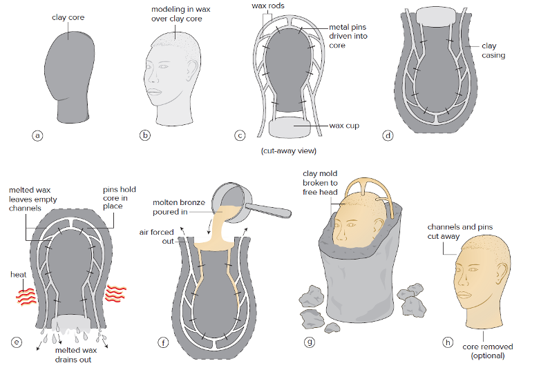
- The most common method for casing metal is called the lost-wax process.
First, a core is built up of specially prepared clay (a). Over this core, the sculptor models the finished head in a layer of wax (b). When the sculpture is complete, wax rods and a wax cup are attached to it to form a sort of “arterial system,” and metal pins are driven through the wax sculpture to the core inside (c). The whole is encased in specially prepared clay (d). When the clay has dried, it is heated so that the wax melts and runs out (hence “lost wax”) and the clay hardens (e). The lost wax leaves a head-shaped void inside the block. Where the wax rods and block were, channels and a depression called a pouring cup remain. The pins hold the core in place, preserving the space where the wax was. Next, the mold is righted, and molten metal is poured into the pouring cup. The metal enters the mold through the channels, driving the air before it (f). When the metal bubbles up through the air channels, it is a sign that the mold is probably filled. Metal, therefore, has replaced the wax, which is why casting is known as a replacement method. When the metal has cooled, the mold is broken apart, freeing the head (g). The channels, now cast in metal as well, are cut away, the clay core is removed (if desired), holes or other flaws are patched or repaired, and the head is ready for smoothing and polishing (h).
Assembly
- Assembly, or assemblage is a type of sculpture that uses a process of manually attached objects and materials together.
Assemblage is often mixed media and often uses found objects. The work can be viewed as a whole or each box as a separate unit. The overall effect of the whole is to recognize that both unity and diversity are possible in a single artwork.
Installation
- Installation is related to assemblage.
It is a fairly new form of art. The intent of installation is to transform an interior or exterior space to create an experience that surrounds and involves the viewer in an unscripted interaction with the environment. Installation is an increasingly popular form of public artwork. This allowed the viewer to experience a momentary loss of control and the emotional response the feel connects them to this art work.
Kinetic Art
- Kinetic art is art that moves.
Generally, this art is sculptural. During the 1930s, the American artist Alexander Calder set sculpture in motion with works that Marcel Duchamp called mobiles. Constructed from abstract forms suspended on slender lengths of wire, they respond with their own weight to the lightest currents of air. Calder is considered to be one of the founders of kinetic art.
Four-Dimensional Art
- Four-dimensional art, or time-based art is a mode of art practice that uses video, projection mapping, performance and new media art.
Video art uses the technology of projected moving images. These images can be displayed on monitors or projects onto walls or buildings. Uses light as the medium. Projection mapping is a type of video projection. Images are able to conform to the surface of the object on which it is being projected using spatially augmented reality.
Performace Art
- The artwork is in the act itself.
Performance art, in which the artist appears “live and in person.” Performance had been a recurring presence in 20th-century art, beginning with events staged by Futurist and Dada artists in the first decades of the century. During the Postminimal years, such actions, events, and happenings became more formalized, and the name Performance art came into general use. Much of the Performance art of the 1970s concerned the relationship between artist and spectator.
Form and Composition
When evaluating a work of art we break it down into its visual or formal elements. These are the elements we perceive and respond to when we look at a work of art.
Elements of Design
These visual or formal elements are broken down into to main categories. The Elements of Design and the Principles of Design. We will look first at the Elements of design. The Elements of Design are the physical parts of the artwork, or the form. There are six basic elements of design to look at.
Line
- A line is an infinite series of points that are arranged in a direction.
Strictly defined, a line is a path traced by a moving point. You poise your pencil on a sheet of paper and move its point along the surface to make a line. Yet lines are not confined to scribbling on a page. Some can reach immense proportions. There are many qualities of line that we are going to look at.
Gesture Line
- Gestural Line - produced by the movement of the artist’s hand, arm, or body.
Calligraphy, or “beautiful writing”, is a good example of a gestural line. You can see the movement of the artist’s hand. Calligraphy has long been renowned for their expressive beauty.
Contour Lines
- Contour lines follow the shapes of object where they stand out from backgrounds.
Contours are the boundaries we perceive of three-dimensional forms, and contour lines are the lines we draw to record those boundaries.
Crosshatching Lines
- Crosshatching is the use of uniformly space intersecting lines that create the perception of value or light and dark.
Hatching is most visible on the right arm of the nude figure, while a grid of cross-hatched lines can be seen clearly on the torso of the clothed man.
Implied Lines
- Implied lines are not drawn at all.
They appear to have line without actually drawning a line made from shapes.
Three-dimensional Lines
- Line be extended into three-dimensional space.
Shape
- Shape can be divided into two categories:
- Geometric
- Organic
A shape is a two-dimensional form, and any two-dimensional image is a system of interlocking shapes. Each shape within the image occupies an area with identifiable boundaries. Boundaries may be created by line, a shift in texture, or a shift in color. Geometric shapes are regular and ordered using straight edges and curves. Organic shapes are generally irregular and often chaotic.
Implied Shapes
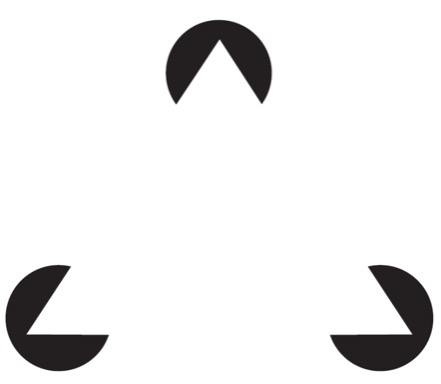
Look at the image above, it shows three black circles, each with a wedge taken out, but the very first thing that most of us see is a floating white triangle. Our mind instantly perceives the visual information as a whole—even though that whole doesn’t exist! This is called reification, when we do not need to see the whole of a thing for our minds to fill in the gaps.. The lines of each wedge and their position in relation to one another cause us to see the triangle formed of negative space at the center. Through optical puzzles such as this triangle, psychology provided a scientific explanation for something that artists had been doing intuitively for centuries, using implied shapes to unify their compositions. Just as artists use implied lines to help direct our eyes around a composition, we perceive the work of art as a unified and harmonious whole.
Figure/Ground Reversal
- Figure - postive space
- Ground - negative space
We perceive shapes by mentally detaching them from their surroundings and recognizing them as distinct and coherent. We refer to this relationship as figure and ground. A figure is the shape we detach and focus on; the ground is the surrounding visual information the figure stands out from, the background. Psychologists have identified a list of principles we use to decide which shapes are figure and which ground. When none of those conditions is met, figure and ground may seem to shift back and forth as our brain organizes the information first one way and then another, an effect known as figure–ground ambiguity, or figure-ground reversal.
Mass
- Mass is the quantity of matter, often meaning its weight.
A mass is a three-dimensional form that occupies a volume of space. We speak of a mass of clay, the mass of a mountain, the masses of a work of architecture. Sculpture, architecture, and all other forms with mass exist in three-dimensional space—that is, the actual space in which our bodies also stand. These works of art take their character from the ways in which they carve out volumes of space within and around them.
Volume
- Volume has three dimensions: Length, width, and height.
- Volume can be either closed form or open form.
Volumes may have interior or exterior contours and may be open or closed in form. Closed form is volume that is not pierced or perforated. Open form sculptures are closer in shape to the figures they represent and are thus more lifelike.
Chiaroscuro
- Italian: meaning “clear-dark” is used to convey the three dimensionality, mass and volume, of forms on a flat surface.
European painters had become interested in modeling mass in two dimensions through value. Discovered and perfected by Italian painters during the Renaissance, the technique is called chiaroscuro, Italian for “light/dark.” With chiaroscuro, artists employ values—lights and darks—to record contrasts of light and shadow in the natural world, contrasts that model mass for our eyes.
Perspective
- Perspective in art is the illusion of space on a flat surface.
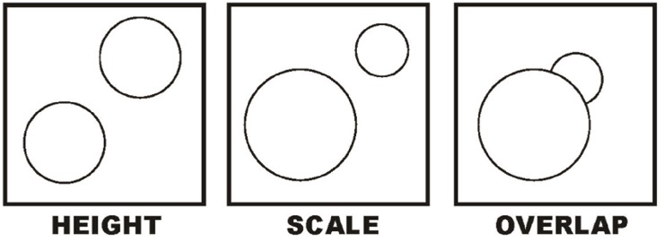
Prior to the development of linear perspective in the 15th century, perspective was created using height, scale and overlap. Objects higher on the drawing surface, objects that are smaller in scale and objects that are partially obscured by other objects all appear further away in space.
Linear Perspective
- Linear perspective is based on
- Forms diminishing in size as they recede from us
- Parallel lines receding into the distance converge at a single pint
- The vanishing point is the spot where all receding lines converge on the horizon line.
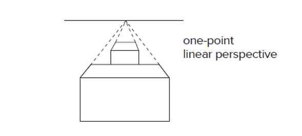
Just as Renaissance artists took note of the optical evidence of light and shadow to model rounded forms, they also developed a technique for constructing an optically convincing space to set those forms in. This technique, called linear perspective, is based on the systematic application of two observations: Forms seem to diminish in size as they recede from us. Parallel lines receding into the distance seem to converge, until they meet at a point on the horizon line where they disappear. This point is known as the vanishing point. You can visualize this second idea if you imagine gazing down a straight highway. As the highway recedes farther from you, the two edges seem to draw closer together, until they disappear at the horizon line.
Two-Point Linear Perspective
- Two-point perspective uses a horizon line and two separated vanishing points to present the illusion of space that recedes in two directions.
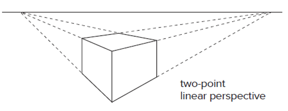
Here you have an object in the foreground and the vanishing points recede to each side.
Three-Point Linear Perspective
- Three-point perspective incorporates the recession of space in a third, vertical direction above or below the horizon line as well a the two horizonal directions of two-point perspective
We have the two-point perspective at the ground level and have added a third point as the building recedes upward into the vertical. Linear perspective is a limited tool for representing how the world looks. It is considered sufficiently “accurate” only within a limited “cone of perception” of about 60 degrees.
Atmospheric Perspective
- Atmospheric perspective is the way in which the illusion of distance is created on a flat surface using color and focus.
Staring off into a series of hills, you may notice that each succeeding range appears paler, bluer, and less distinct. This is an optical effect caused by the atmosphere that interposes itself between us and the objects we perceive. Particles of moisture and dust suspended in the atmosphere scatter light. Of all the colors of the spectrum, blue scatters the most; hence the sky itself appears to be blue, and things take on a bluish tinge as their distance from us increases. The first European artist to apply this observation systematically was Leonardo da Vinci, who called the effect “aerial perspective.” A more common term today is atmospheric perspective.
Texture
Texture refers to surface quality—a perception of smooth or rough, flat or bumpy, fine or coarse. Our world would be bland and uninteresting without contrasts of texture. We look for textural interest in all facets of our environment. An outstanding feature of texture: It makes us want to touch it.
Actual Texture
- Actual texture is primarily, though not exclusively, sculptural.
Actual texture is literally tactile, a quality we can experience through touch.
Implied Texture
- Impasto, or very thick application of paint, can be used to heighten the sense of reality by adding actual texture.
Implied texture is primarily used in two-dimensional works. Dutch painters delighted in capturing visual texture in paint. One main goal was to tell the truth about the material world.
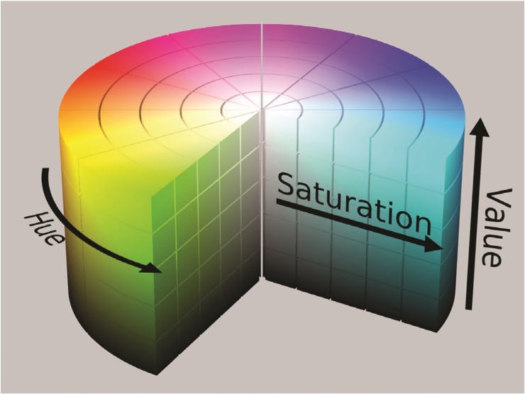
Color
- Color is the most prominent element of design.
- Color can be broken down into these parts: hue, saturation, and brightness.
- Hue is the name of the color.
- Saturation is the purity of a color.
- Brightness is the lightness or darkness of a color.
It is probably safe to say that none of the visual elements gives us as much pleasure as color. Many people have a favorite color that they are drawn to. Various studies have suggested that color affects a wide range of psychological and even physiological responses. The mechanism involved in these color responses is still unclear, but such studies indicate that color affects the human brain and body in powerful ways.Much of our present-day color theory can be traced back to experiments made by Sir Isaac Newton, who is better known for his work with the laws of gravity. In 1666, Newton passed a ray of sunlight through a prism, a transparent glass form with nonparallel sides. He observed that the ray of sunlight broke up or refracted into different colors, which were arranged in the order of the colors of the rainbow. By setting up a second prism, Newton found he could recombine the rainbow colors into white light, like the original sunlight. These experiments proved that colors are actually components of light. In fact, all colors are dependent on light, and no object possesses color intrinsically. The physiological activity of the human eye and the science of electromagnetic wavelengths take part in this process.
Color Wheel

If we take the colors separated out by Newton’s prism — red, orange, yellow, green, blue, and violet — add the transitional color red-violet (which does not exist in the rainbow), and arrange these colors in a circle, we have a color wheel.
- Primary Colors — red, yellow, and blue — are labeled with the numeral 1 on the color wheel. They are called primary because they cannot be made by any mixture of other colors.
- Secondary Colors — orange, green, and violet — are labeled with the numeral 2. Each is made by combining two primary colors.
- Intermediate Colors, also known as tertiary colors, labeled number 3, are the product of a primary color and an adjacent secondary color.
Additive Color
- The primary hues of additive color are red, green, and blue.
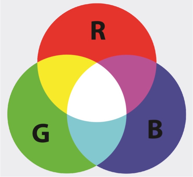
Colors behave differently depending on whether an artist is working with light or with pigment. In light, as Newton’s experiments showed, white is the sum of all colors. People who work directly with light—such as lighting designers who illuminate settings for film, theater, or video productions—learn to mix color by an additive process, in which colors of light mix to produce still lighter colors. For example, red and green light mix to produce yellow light. Add blue light to the mix and the result is white. Thus red, green, and blue form the lighting designer’s primary triad.
Subtractive Color Mixing
- Subtractive color mixing starts with the primary colors of red, yellow and blue.
- The CMYK (cyan, magenta, yellow, and black) model was developed by chemists in the 20th century for use in commercial printing inks.
Pigments, like any other object in the world, give to our eyes the color that they reflect. When pigments of different hues are mixed, the resulting color is darker and duller, because together they absorb still more colors from the spectrum. Mixing pigments is thus known as a subtractive process. This process resulted in the CMYK model used in commercial printing inks.
Color Temperature
- Warm colors include red, orange and yellow.
- Cool colors include green, blue and violet.
Color temperature is the idea that color can appear to be either warm or cool. We speak of the colors on the red-orange side of the wheel as warm colors, perhaps because of their association with sunlight and firelight. The colors on the blue-green side are cool colors, again probably because of their association with sky, water, shade, and so on. A work of art may have a predominantly warm or cool palette.
Monochromatic Color Scheme
- A single color.
Monochromatic color schemes are composed of variations on the same hue, often with differences of value and intensity.
Complimentary Color Schemes
- Colors opposite to each other on the color wheel.
Complimentary Color Scheme involve colors directly opposite each other on the color wheel, such as red and green. Complementaries “react” with each other more vividly than with other colors, and thus areas of complementary color placed next to or even near each other make both hues appear more intense.
Analogous Color Schemes
- Colors in one area of the color wheel (colors that are adjacent to one another).
After Image with Complementary Colors
Certain uses and combinations of colors can “play tricks” on our eyes or, more accurately, on the way we perceive colors registered by our eyes. Artists sometimes intentionally exploit these ”tricks”. Prolonged staring at any saturated color fatigues the receptors in our eyes, which compensate when allowed to rest by producing the color’s complementary as a ghostly afterimage in the mind. An afterimage can occur when you look at an image and then a white wall. You should see the image projected in its complimentary colors. The compliment of green is red, the compliment of orange is blue, and the compliment of black is white.
Gradient Illusion
- Natural or local color – describes the color of a given object.
- Observed color - the perception of that local color as light shifts on an object.
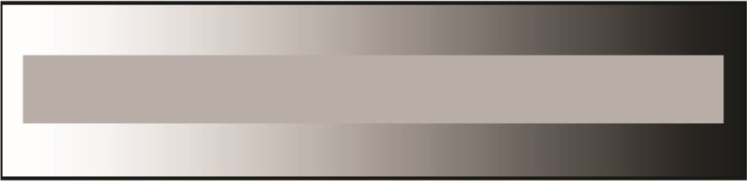
Josef Albers shows this in his book Interaction of Color (1963). The gray band is one single color, but it appears to shift when placed on a contrasting background.
Monet’s Rouen Cathedral
Principles of Design
- There are five major principles of design:
When an artist sets about making any work, he or she is faced with infinite options. How big or small? What kinds of lines and where should the lines go? What kinds of shapes? How much space between the shapes? How many colors and how much of each one? What amounts of light and dark values? Somehow, the elements we discussed must be organized in such a way as to satisfy the artist’s expressive intent. In two-dimensional art, this organization is often called composition, but the more inclusive term, applicable to all kinds of art, is design. The task of making the decisions involved in designing a work of art would be paralyzing were it not for certain guidelines that, once understood, become almost instinctive. These guidelines are usually known as the principles of design.
Unity/Variety
- Unity is a sense of oneness
- Variety is difference
Unity is a sense of oneness, of things belonging together and making up a coherent whole. Variety is difference, which provides interest. We discuss them together because the two generally coexist in a work of art. A solid wall painted white certainly has unity, but it is not likely to hold your interest for long. Take that same blank wall and ask fifty people each to make a mark on it and you will get plenty of variety, but there probably will be no unity whatever. Unity and variety exist on a spectrum, with total blandness at one end, total disorder at the other. For most works of art, the artist strives to find just the right point on that spectrum—the point at which there is sufficient visual unity enlivened by sufficient variety.
Scale/Proportion
- Scale and proportion is the issue of size of elements both individually and in relation to other elements.
Proportion and scale both have to do with size. Scale means size in relation to a standard or “normal” size. Normal size is the size we expect something to be. Proportion refers to size relationships between parts of a whole, or between two or more items perceived as a unit.
The Leaning Tower of Pisa: Forced Perspective
- Forced perspective - the arrangement of figure and ground that distorts the scale of objects.
Balance
- Balance – ‘visual weight’
- Two types of balance
Symmetrical Balance
- Symmetrical balance is when the lines and shapes in a composition are around an axis.
Vertical and horizontal axes are generally reserved for very stable compositions. The two halves of the composition thus correspond exactly, with the axis as the center of gravity.
Asymmetrical Balance
- Asymmetrical balance is achieved when visual weights do not correspond to one another in shape, size or placement.
An asymmetrical composition has two sides that do not match. If it seems to be balanced, that is because the visual weights in the two halves are very similar. What looks “heavy” and what looks “light”? The only possible answer is, that depends. We do not perceive absolutes but relationships. The heaviness or lightness of any form varies depending on its size in relation to other sizes around it, its color in relation to other colors around it, and its placement in the composition in relation to the placement of other forms there. An obvious imbalance can produce the effect of unsteadiness, disorientation or distress.
Emphasis/Movement
- Emphasis/movement is the intentional use of directional forces to move the viewer’s attention through a work of art.
Emphasis/movement is the intentional use of directional forces to move the viewer’s attention through a work of art. Emphasis means that our attention is drawn more to a certain part of a composition. Movement is how our vision moves thought the areas of emphasis. Lines in a work of art compels us to follow its directional flow.
Rhythm/Repetition
- Rhythm is the repetition of visual elements to establish a pattern.
Rhythm is based on repetition, and it is a basic part of the world we find ourselves in. Natural rhythms measure out the passing of time, organizing our experience of it. To the extent that our arts take place in time, they, too, structure experience through rhythm. Music and dance are the most obvious examples. Poetry, which is recited or read over time, also uses rhythm for structure and expression. Looking at art takes time as well, and rhythm is one of the means that artists use to structure our experience. A pattern can be used to provide a stage for an object, or a pattern can be interrupted to direct attention to the change.